You might not realize it now, but as the years tick by you’ll be utterly thankful that you thought about your retirement plan years in advance.
Unfortunately, not many of us actually do this. We think about retirement when it’s too late. During our younger days we are keen to splurge all of our pay cheques, and it’s only later down the line where reality sort of hits home.
All isn’t lost, just yet though. We have pulled together some of the most interesting graphics on the subject of retirement, to hopefully give you as much of an idea of how to plan accordingly for this period of your life.
“Comfortable” – it doesn’t just mean financially comfortable
Today’s post has been titled with the term “comfortable”. Immediately, most people think that this revolves around finances and in a lot of ways, it does.
There is far more to a comfortable retirement than the size of your retirement pot though. This first infographic, which takes a look at the best places for retiring in, highlights this down to a tee. It collects all sorts of stats and showcases the very best, and worst, places to spend your latter years.

https://www.adc-fl.com/best-worst-cities-for-retiring-united-states/
The hard-financial reality of retirement
Now, onto the finances. Unfortunately, it doesn’t always make for pleasant reading but to set the scene, let’s hand you this next infographic. Nothing else needs to be said, just take in the following and take action.

https://visual.ly/community/infographic/lifestyle/are-brits-ready-retirement
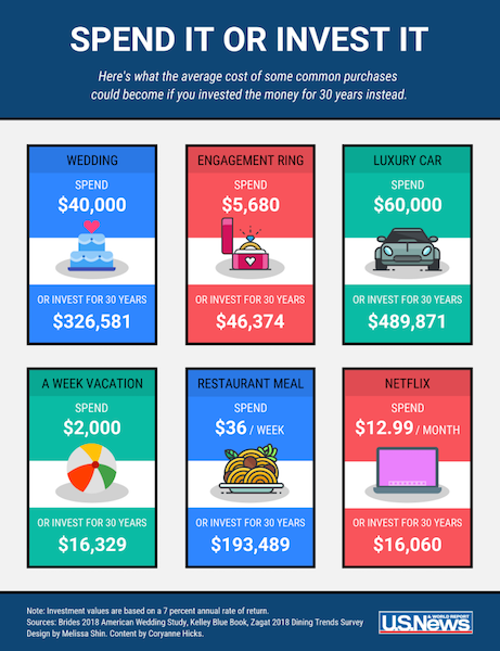
Earn $326,581 instead of getting married
OK, the headline might be something of an exaggeration, but give us time. This next infographic looks at some of the biggest expenses you will come across in your life, and shows what return you would get on them if you invested for thirty years.
As you can see, the value of investment is absolutely huge. A $40,000 wedding as an example, could net you that six-figure number we showcased in the headline.
Of course, there are plenty more examples. You don’t have to shun a wedding, but what about that house renovation you are planning. Do you really need it? Or over time will it make up a potential retirement shortfall?
How much money do you need to retire?
Here’s the million-dollar question, if there ever was such a thing.
This infographic takes a look at all sorts of statistics to set the scene for what you truly need for retirement. It takes a look at everything from the average age in which the typical American will retire right the way to, you guessed it, how much you actually need. It breaks things down around the country, around the world and for anyone who likes data, this is one of the best infographics around.
https://medalerthelp.org/how-much-money-do-i-need-to-retire-infographic/#top_ankor
Should you sell your home?
Many of us get on the housing ladder so that we can head into retirement with all our bills paid. This next infographic might make you question such an approach, as it looks at the pros and cons of both approaches.
There is no right answer to this, but the infographic does provide some food for thought on a topic that many readers might not have decided to question.
When all is done…
When all is done, how are the country really spending their retirement?
Contrary to what some sources might suggest, it's not just about treading water. This is a period where
you can enjoy life, and this infographic shows how some will turn to travel, others might relocate, while
some will even continue working! It again just provides a different perspective on the R-word.