
 Some homes don’t need new structures. They need a new read. The layout is already there, the space works, but the exterior doesn’t communicate anything clearly. You see it often. A house with good bones that still feels visually quiet. Nothing draws your attention, nothing guides your eye, and nothing holds together long enough to make an impression.
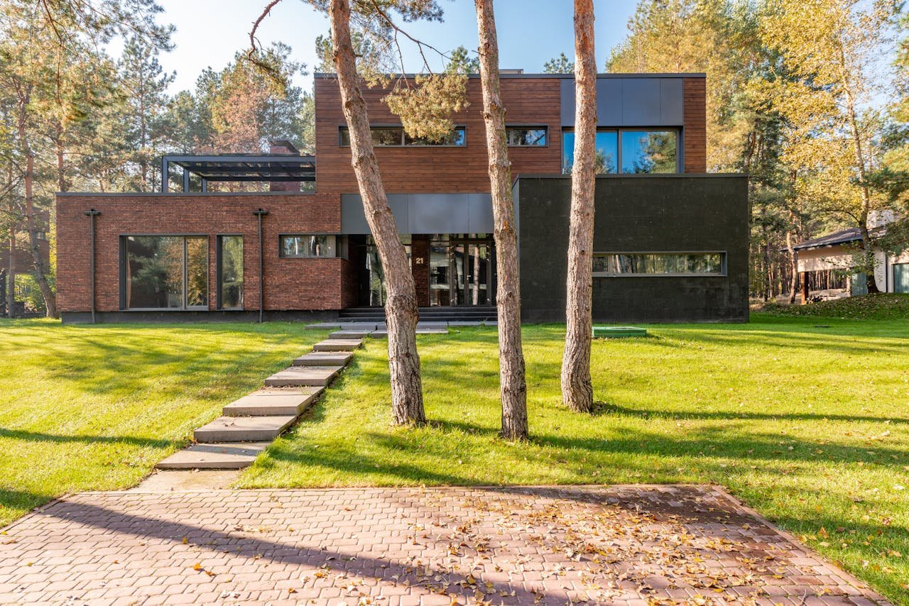
In Syracuse, NY, that shows up in very specific ways. Older façades with evenly spaced but undersized windows, siding broken into too many sections, and entryways that sit flat instead of pulling you in. You’ll notice homes where every element feels safe, but nothing feels intentional. The difference between “fine” and “striking” in these neighborhoods usually comes down to how the exterior is reworked, not how much is replaced.
New Windows and Exterior Balance
Window changes aren’t about swapping old frames for new ones. They’re about correcting proportion. A façade reads differently depending on how those openings are placed, how large they are, and how they relate to each other. Smaller windows scattered across the front tend to weaken the structure visually. Larger, more deliberate placements align everything.
Given this, many homeowners looking into window replacement in Syracuse, NY often work with specialists who understand exterior balance, not just installation. A wider window along a main living area can stretch the façade horizontally. Taller windows near an entry can pull the eye upward. Done right, the house starts to feel composed, almost like it was designed that way from the start.
Mixed Materials for Depth
Flat siding across an entire façade rarely holds attention anymore. It reads as one surface, one texture, one idea. Bringing in multiple materials introduces contrast that creates movement across the exterior without adding clutter.
Think of a home where the entry is wrapped in vertical wood panels, while the rest of the structure remains in a neutral siding. That transition alone gives the entrance weight. Add a low stone base, and suddenly the house feels anchored instead of sitting lightly on the ground.
Continuous Front Elevation
A lot of older homes break themselves visually without realizing it. Different trims, small offsets, and abrupt material changes interrupt the façade over and over. Your eye doesn’t settle anywhere because it keeps getting redirected.
Reworking that doesn’t mean removing the character. It means extending lines so they carry across the structure. For example, continuing one siding material across a larger portion of the front or aligning horizontal elements like window trims creates a smoother visual flow. Once those interruptions are reduced, the house starts reading as one complete form rather than a collection of parts.
Oversized Fixtures as Anchors
A façade without a focal point tends to fade. Even with updated siding or new windows, there’s nothing that tells your eye where to land. That’s where scale comes in.
Larger fixtures give the exterior a sense of direction. A pair of tall, matte black sconces flanking the entry can immediately define that space. Oversized house numbers placed with intention can become a feature rather than an afterthought. Even a bold mailbox or entry handle can carry weight if it’s sized correctly. These elements don’t compete with the house. They stabilize it visually, giving the entire exterior something to organize around.
Off-Center Entry Placement
Centered entryways feel predictable because they follow a pattern most people have seen repeatedly. Shifting the entry slightly off-center changes how the façade is experienced. It introduces tension in a way that feels intentional rather than accidental, especially when the rest of the structure supports that movement.
Picture a home where the entry is moved toward one side and balanced with a vertical panel or a window grouping on the other. The eye moves across the façade instead of stopping in the middle. This movement creates interest without needing decorative elements. The house feels designed, not just arranged, and the entry becomes something you notice rather than something you pass by.
Roofline Adjustments
The roofline is one of the first things people register, even if they don’t realize it. A simple change along the edges can completely alter how the home is perceived. Extending an overhang, sharpening a line, or introducing a subtle variation in height can give the structure more presence.
In many cases, homes with flat or unremarkable rooflines feel visually compressed. A slight extension over the entry or a clean edge running across the front can open that up. It changes the silhouette without changing the footprint. The house begins to feel more deliberate, almost like it was drawn with intention rather than built in pieces.
Driveway Reworking
The way you approach a home impacts your first impression long before you notice any details on the façade. A driveway that leads straight in without any thought tends to feel purely functional. Adjusting its alignment or width can shift that experience entirely.
For example, a slightly widened entry that curves just enough to frame the house changes how it’s seen as you arrive. It gives space for the structure to be viewed instead of being rushed toward. Even the material used, whether it’s concrete, stone, or pavers, can tie into the exterior design and make the transition from street to home feel intentional rather than abrupt.
Landscaping as Structure
Landscaping can define how the entire exterior is read. Poorly placed plants or uneven growth often compete with the structure, while deliberate placement supports it.
Think of low, structured greenery guiding the eye toward the entry, or taller elements placed to frame certain sections of the façade. Clean lines in landscaping can echo architectural lines, reinforcing the overall design. It’s not about adding more plants. It’s about placing them in a way that strengthens the form of the house rather than distracting from it.
Architectural Screens and Panels
Screens and slatted panels introduce a layer that feels both functional and expressive. They create partial separation without closing off space completely, which adds depth to the exterior.
Used near entries, side sections, or even along upper levels, these elements bring texture and rhythm. They can filter light, create shadow patterns, and add a sense of layering that flat walls don’t provide. A home that once felt exposed or plain begins to feel more composed, with sections that interact with light and space differently throughout the day.
Large-Format Cladding
Small siding pieces and frequent seams tend to create visual noise. Your eye keeps stopping at every line, which makes the façade feel busy even if the design is simple. Large-format panels change that experience.
Fewer joints and broader surfaces allow the structure to read as a whole. The exterior feels stronger, more grounded, and more current. A house finished with larger panels often appears cleaner without feeling minimal.
Reworking an exterior comes down to making stronger decisions about what stays, what shifts, and how each element connects. A home that once felt ordinary can take on a completely different presence when proportion, materials, and layout start working together.